Header_left
Header_right
Click to scale the y axis
Drag to scale/move the x axis
Click and drag to draw boxes over transits
Days from beginning of the quarter

  • Type of star:
  • Apparent visual magnitude:
  • Temperature
  • Radius

Are there any big breaks or gaps in the light curve?

The data here are recorded on electronic devices, and sometimes electronic devices have glitches, like the images below. This could happen when the Kepler detector gets hit by a stray cosmic ray, or when the spacecraft turns to send data back to Earth.

en, examples

Break_one Break_two

Is the star variable?

If you see that there are no patterns, just white noise - like the example below - these light curves are best categorized with the middle "quiet" icon.

Quiet Quiet_icon

Other light curves - like the one below - show clear patterns. We think that most of the variability is caused by star spots, or pulsations. Having Planet Hunters sort these light curves as variable is an important part of the scientific research that we're trying to do.

Variable Irregular Variable_icon

Type of variability

If the light curve is changing rapidly (timescale of hours or up to a couple of days) then "pulsating" is the best answer Pulsating 
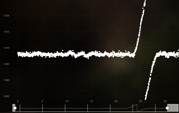
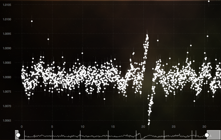
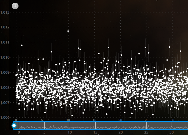
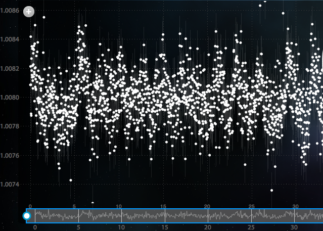
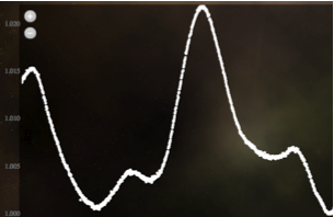
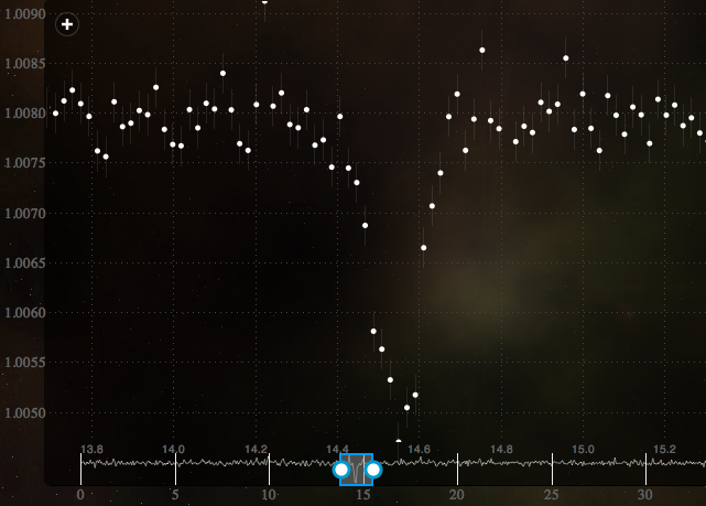
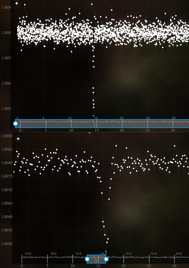
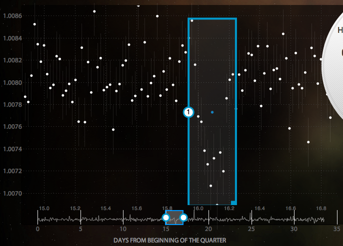
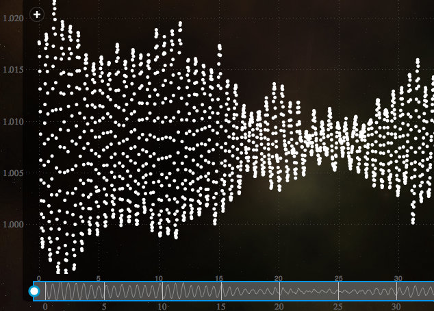
. If the light curve varies predictably but more slowly - even if there are a couple of peaks with different heights - then "regular" is the best answerRegular
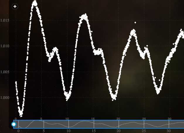
. Light curves that rise and fall unpredictably should be labeled "irregular."Irregular

Are there any transits?

A 'transit' is shorthand for a planet passing in front of it's host star (or transiting across it). Transits look different than other changes in star light, because when a planet passes in front of a star, it dips down suddenly, as it crosses the star in just a few hours. It can be tricky to spot these, especially if the planet is small. Here are some examples of what to look for: Transit1 Transit2 Transit3

Marking the transits

To mark a transit, click the + button to add a box. Move the box to the location you want to mark by dragging anywhere inside the box. Resize the box by clicking and dragging the lower-right corner until you have the size you want. You can also zoom the graph to get a closer view using the blue resizable bar at the bottom of the graph